

This post first appeared on Edudemic.
As students begin producing a plethora of digital work – and connecting and sharing that work with the world – we need to take a step back and teach them to think a little more about typography and design. This was not important when I was in school because I either wrote everything by hand, or used a computer with less ubiquitous font choices.
Today, anyone with a computer can basically take a stab at typography and design. I have personally been the recipient of papers that were barely legible, despite the fact that they were typed. I have sat through presentations with font so small and unpleasant that it was hard to make out what is being said. This has to stop!! In this digital age, we must all become connoisseurs of design, able to understand it, teach it and model good use. Beth Holland, a colleague of mine, used to tell students that Paul Rand – a famous graphic designer asks two questions – “Is it appropriate? And Is it legible?”
Know Your Fonts
What is the difference between Serif and Sans Serif?
There are two types of font – serif and san serif. There is one simple difference between them. Serif fonts have little design elements, or small details, at the end of each stroke that are supposed to help move the eye from one letter to the next making it easier to read. An example would be Bodoni. Sans Serif fonts – sans coming from the french word meaning without – do not have these design elements. They are simple like Steve Jobs personal favorite, Helvetica. Understanding this is important for students. If they are writing a lengthy paper they might consider using serif fonts to help guide the readers eye and make the process more comfortable – but this is only true if the paper is actually printed out. Since students today are starting not to print out work, they would want to switch their font to sans serif.
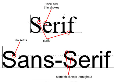
“It is generally accepted that san serif fonts work better on computer screens as they lack the counter strokes and then lines of the serif typefaces that can be hard to read at low resolutions.” (Reynolds, Garr: Presentation Zen)
If students are designing a media rich project such as an iMovie or presentation, they may want to consider using a san serif font because they are more simplistic and stylish. With these types of products students should not be concerned with readability as much as clarity.
Compile Some Favorites
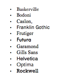
We should work from a repertoire of about 10 fonts and use those consistently – and learn to make critical thinking decisions about font choice. Many typographers agree that there are certain fonts that have good design elements and can reliably be used. These include the following from a list compiled in Presentation Zen Design by Garr Reynolds
I would argue this list may be a bit outdated, and only about two of them appear on my personal list of 10 fonts. Two of my personal favorites are Monserrat and Verdana. I let my students know that I enjoy reading papers constructed in Verdana, and tell them they should ask each teacher about his or her favorite font or preferences – it is part of knowing your audience.
The web, via an individual computer, does not necessarily have the ability to show all of these fonts, and if you use them you run the risk of your content being a bit distorted as a computer will look for a similar alternative for fonts not available on that machine. There are web fonts that are supposed to ship on every machine – these include: Arial, Courier New, Times New Roman, Comic Sans, Impact, Georgia, Trebuchet, Webdings and Verdana. Thus they have become a staple for Web designers and people producing content online.
Side Note: Comic Sans has been a well publicized controversial font in the last five years. Most people either hate it or love it. Personally, I am not a fan. If you need a reason to discontinue the use of Comic Sans please visit the site Comic Sans Criminal.
Simplicity of Design

Fonts can have a harmonious or a disruptive effect on the products we produce. A good rule of thumb for the number of fonts used on one element, such as a slide deck, is one or two. Picking two that are harmonious can be difficult. Instead, consider using the same font with differing sizes this gives the feeling of variety without making the typefaces clash.
I always have students write up one paragraph about why they choose the font they did – this forced them to critically think about the design process – even when simply writing a paper. I have received numerous emails since thanking me for making them “think about fonts.”
What’s Your Font Disposition?
Type sets a tone – whether you know it or not, people are making judgements about you based on the type you choose. The type you choose may depend on your personality. “Although people in the audience are not consciously aware of it, your selection of typeface says something about your content and even about you.” (Reynolds, Garr. Presentation Zen Design) Go ahead make a list of your 10 favorites and really think about them in a critical way. Is this font better for long pieces of work or for a presentation? Why?
You might not have time in a classroom period to talk about font selection, but maybe a day of design before a big project that will be produced digitally, would serve as a great first step. To help understand this kind of design, consult Presentation Zen Design by Garr Reynolds.
For Fun: Everything you want to know about fonts or type.